Volee
A platform for managing volunteers and scholarships, built with a team across three design sprints.
Customer problem
Scholarship managers and volunteers repeat the same tasks all day because the information lives in separate systems. Nobody can see the whole picture, so everything has to be chased by hand.
The brief
Build a SaaS product for a non-profit of our choosing.
We chose the scholarship programmes run by youth centres in cities across Israel. Students who apply for a scholarship have to volunteer a set number of hours to receive financial aid, and the centres run activities for them to fill those hours. Two people on the team had been through the programme themselves, so we knew where it hurt.
Personas
Ortal Gadot
Student scholarships coordinator, Karmiel city council- Needs
- To run the programme efficiently, without paperwork standing between her and the work.
- Gap
- Every task spans several systems that do not talk to each other.
Ran Naor
First-year student, unemployed- Needs
- To clear his volunteer hours around a full timetable and get his tuition paid.
- Gap
- Bureaucracy he cannot see the state of, and no reliable count of approved hours.
Solution
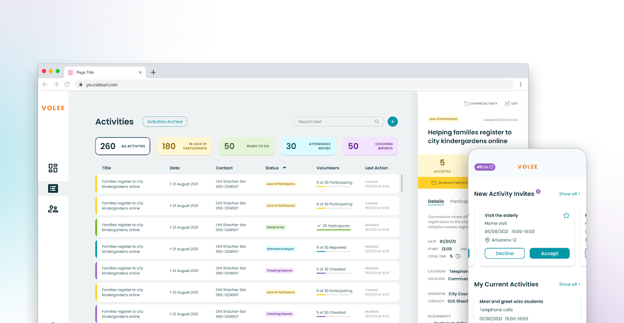
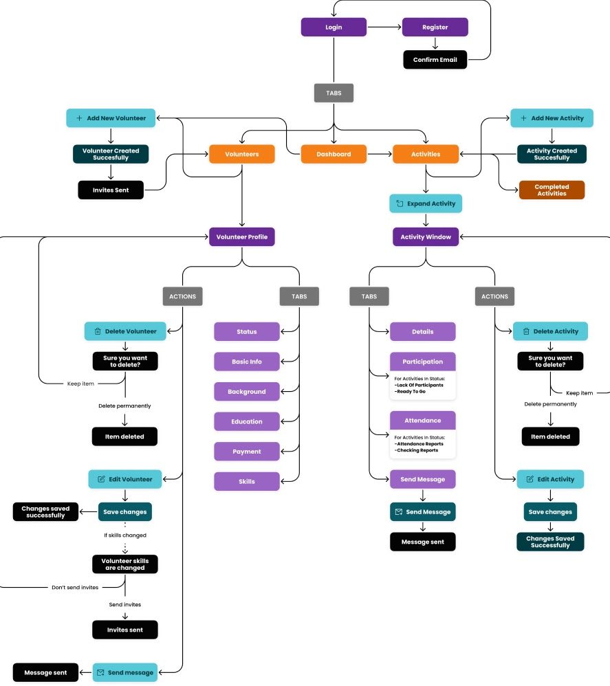
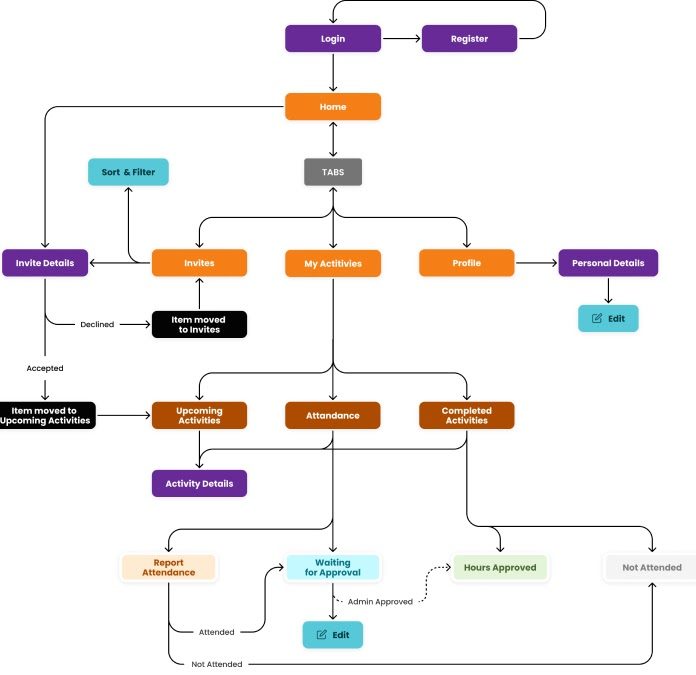
One platform that holds the information both sides need and puts it where the daily routine actually happens: a manager console on the web, and a volunteer app on the phone.
User flows
KPIs
We set targets for each side of the platform, plus one that only counts if both sides work.
- Managers. Cut the time it takes to find volunteers for an activity. Cut the number of activities that run short of participants.
- Volunteers. Cut the irrelevant messages a volunteer receives. Raise their confidence that approved hours are being counted.
- Both. Cut the cases of wrong or unreported attendance.
Design process
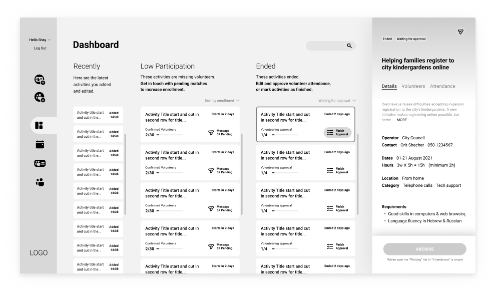
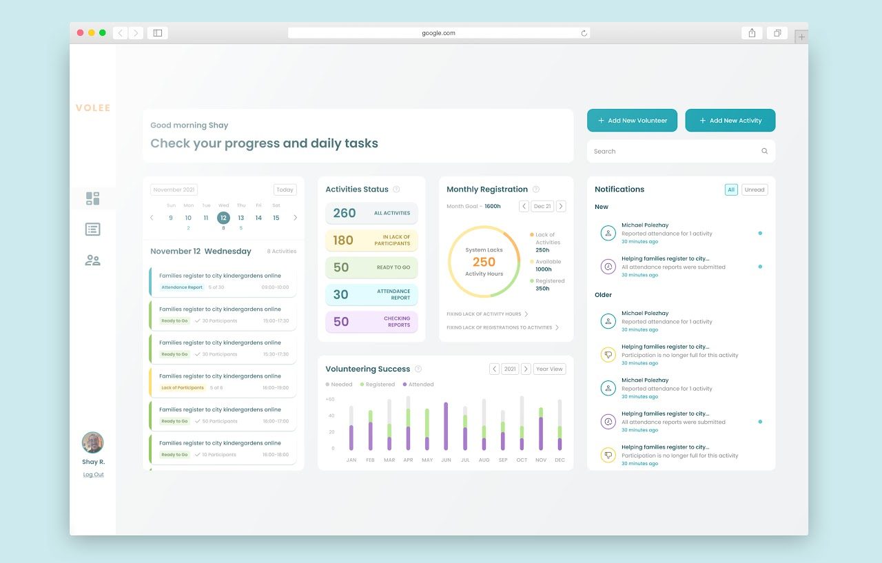
Research showed the manager's real problem was volume: too many small tasks arriving every day. The dashboard came out of brainstorming as the place to see them and act on them. Two tasks kept repeating, so those set the shape of the screen.
- Getting more people into an activity that is about to run.
- Checking who attended one that already has.
Version 1, low fidelity. Each type of task got a column of activity cards. Selecting a card opened its details in a side panel, and every card carried a shortcut button into the task.
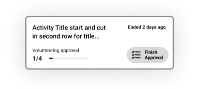
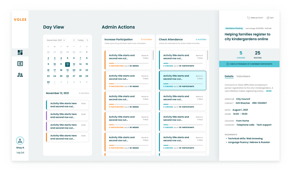
Version 2, mid fidelity. Testing found a conflict inside the card. Selecting it opened the side panel, but the button inside it started a different flow, and people could not predict which they were about to get. We took the button out of the card and gave it a prominent place in the side panel instead.
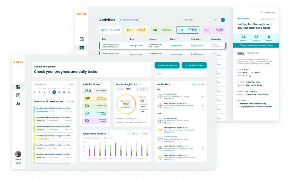
Version 3, final. Usability testing made it clear the dashboard was too much to absorb as the first screen of the app. We moved the full task flows to the Activities page and let the dashboard do one job: monitoring. Activity statuses now surface anything the admin has to deal with.
Design system
Usability testing
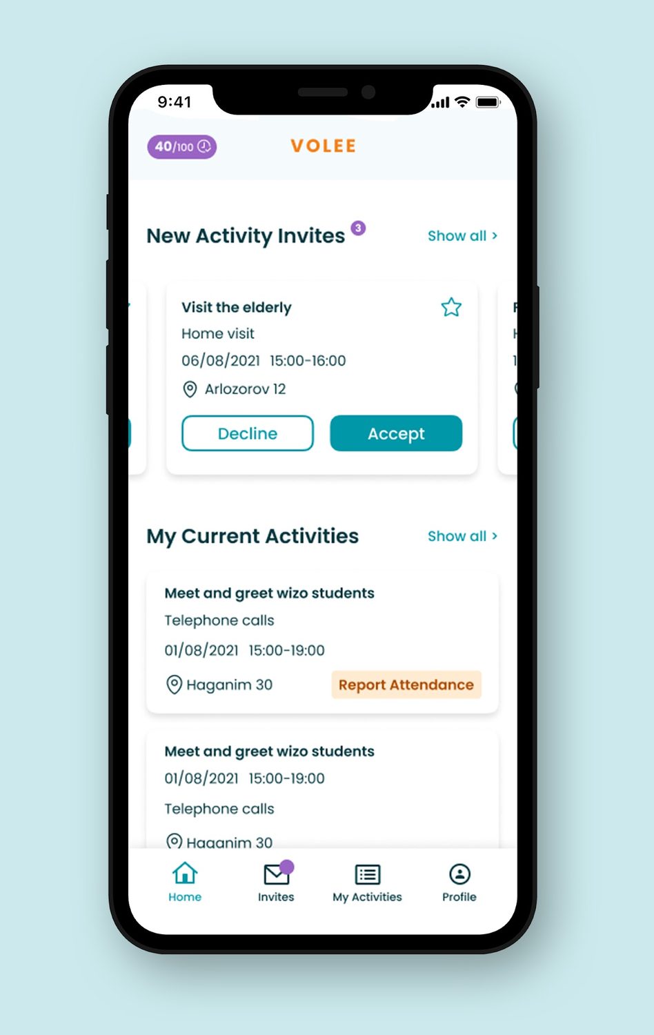
We ran the project in three sprints of three to six weeks. The third built the volunteer side as a mobile app, and we tested it once the prototype was up. Four flows, and what each one told us:
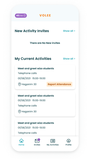
Home. Some people thought invitations only appeared here, and that they were finished once the list emptied. Renaming the button from "Show all" to "All invites" points at the rest of them. Invitation cards and activity cards also read too alike, so they need to look different.
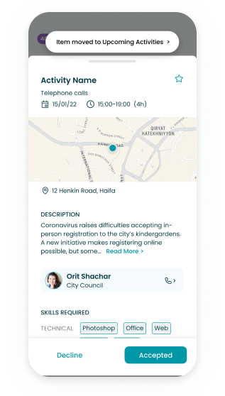
Invitation drawer. The feedback for choosing a response was too quiet, and several people missed the snackbar pointing at where the item had moved. The response buttons should change more visibly once tapped, and the snackbar needs room around it to register.
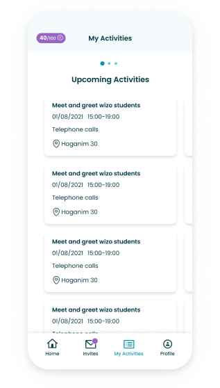
My activities. Anyone who did not scroll the Kanban view never found the Attendance and Completed sections. They need a cue that says something is there, and that the two sections differ.
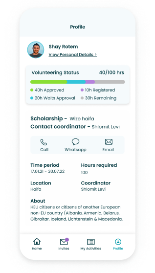
Profile. Nobody could say what "Registered hours" meant, and finding scholarship details took longer than it should. We renamed the label to "Upcoming" hours and reorganised the screen so the information has a clear order.
Prototype
What I learned
- Design sprints and goal-based design, working backwards from MVPs and KPIs.
- How hard an MVP is to hold onto. We believed in the idea and kept generating more of it, which cost us time.
- What the different roles in product design feel like from the inside, and where my own strengths and weaknesses sit.
- To test during the work rather than at the end. The last round found problems we could have caught weeks earlier.
Given more time we would fix what the final usability test surfaced and build the features we had designed but could not fit into the schedule.