Unified Picker
One content-selection system replacing six inconsistent pickers across Flow Designer and Playbook Automation Designer. Shipped as a reusable component, then audited to confirm it held.
Customer problem
Six places in Workflow Automation ask a user to pick content, and six different pickers had grown to serve them. Before proposing anything unified, I audited what each one actually contained. The inconsistency that surfaced is the argument for the whole project.
| Picker | Fields present |
|---|---|
| Trigger | Category (record / scheduled / application), Application, Name, Description |
| Actions | Recent/Popular, Installed/Uninstalled, Application, Name, Category as an unlabelled grey divider bar, Description |
| Logic | Category (always empty), Application (always global), Name, Description (only visible in diagram view) |
| Subflow | Application, Flow type, Category (not used: shows only “default”, source unknown) |
| Steps | Category (ServiceNow Data / Utilities / Integrations), Name, Description |
| Activities | Application, Category (interactive / non-interactive), Name, Description, Create new |
That fourth row is worth keeping honest. The audit could not fully explain the existing Subflow picker’s behaviour, and said so rather than assuming the legacy logic made sense.
On top of the structural mess, users reported concrete damage:
- Action names truncated.
Current designs considered too sparse, with low information density.
The picker is not big enough.
- Search defaulting to recent selections, which was actively causing mis-selections.
The brief
Establish UX consistency of selecting content for Workflow Automation products, while
enabling future integration for proactive content recommendations.
This is not a feature. It is a design-system consolidation across Triggers, Actions, Logic, Subflows, Steps and Activities, spanning two products.
Personas
Three named professionals were interviewed. The most valuable finding was not a consensus. It was a genuine disagreement about how far to lean into AI, and resolving it without picking a side became the spine of the design.
Experienced developer
Eric Riemer, Product Excellence- Needs
- Density, full names, and basics that don’t regress while attention goes to AI.
- Position
AI-first approaches might not work for all customers, especially experienced developers.
Implementation architect
Shamma Negi, Accenture- Needs
- Natural-language search; results that are current rather than cached-stale.
- Gap
- Search defaulting to recent selections was producing wrong picks.
Non-technical builder
via Laszlo Balla, Developer Advocacy- Needs
- To describe intent in plain language instead of knowing which spoke to look in.
- Wants next
- Conversational editing and generating new actions on the fly.
Instance admin
Governance- Needs
- To decide whether AI search is switched on for their instance at all.
- Gap
- A feature silently hidden from non-admins never gets adopted.
Solution
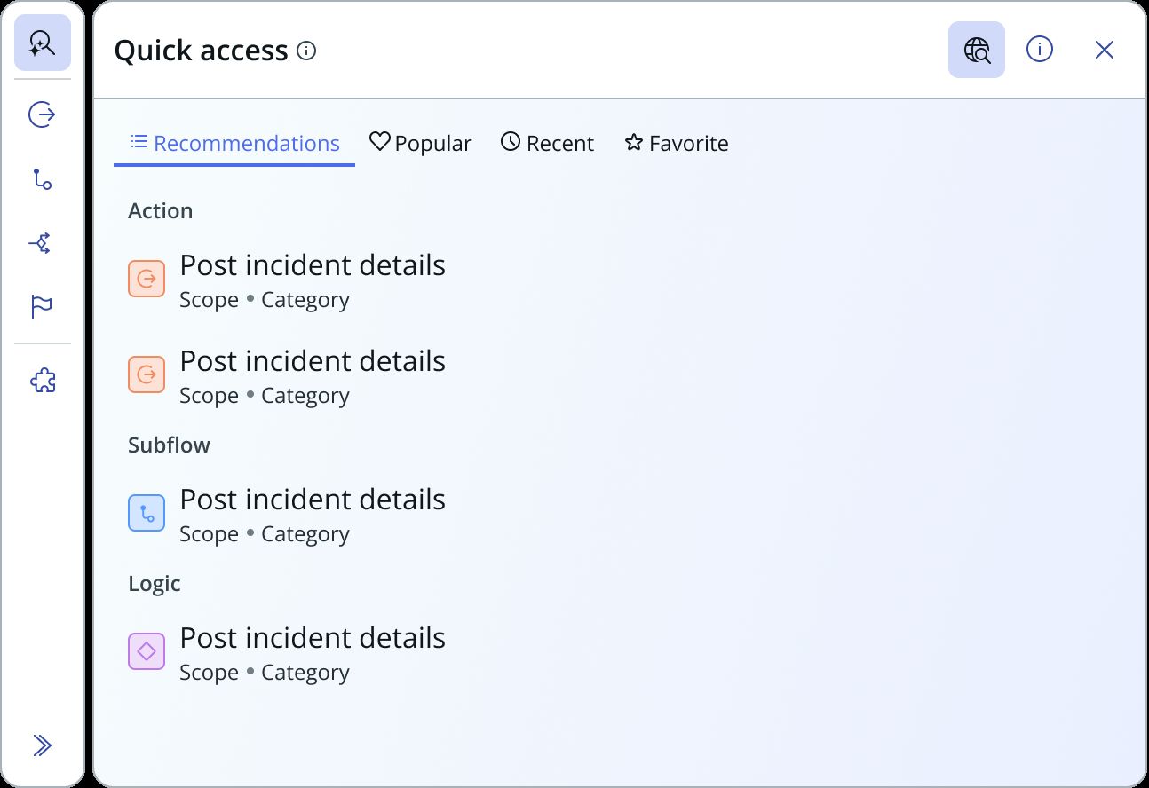
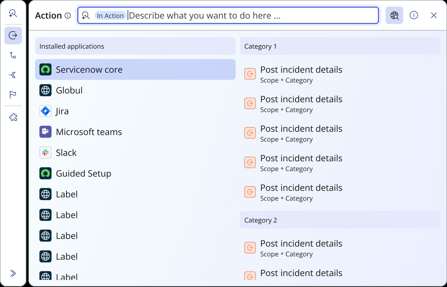
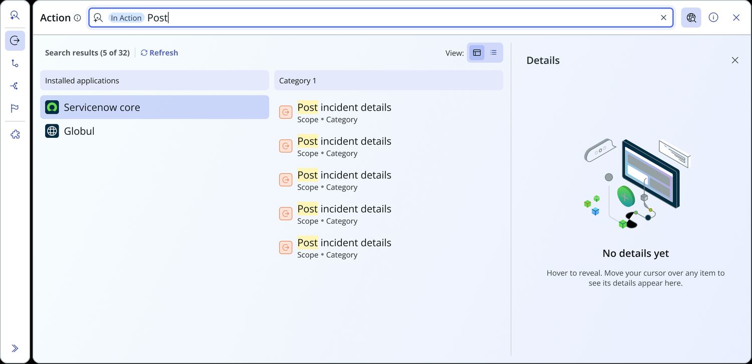
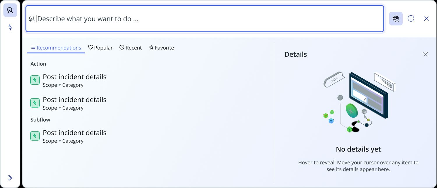
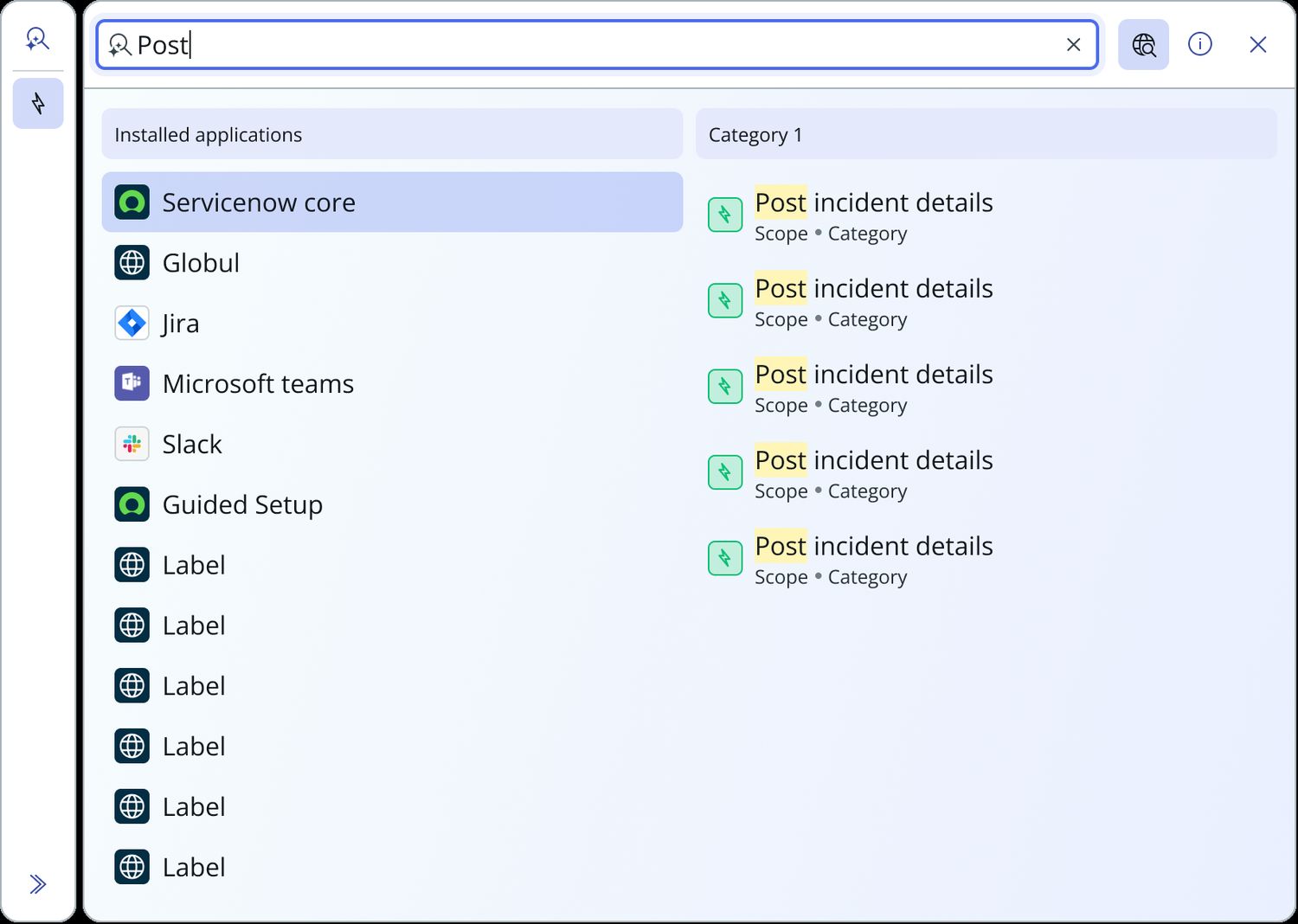
- Four principles the whole component is built on. Groups: content organised by a defined value like Application, or a determined one like Recommended, Recent and Favourites. Details: a description shown on demand, per item. Create: a role-gated shortcut to make new content of the selected type inline. Switch: change content type mid-selection where that is contextually relevant.
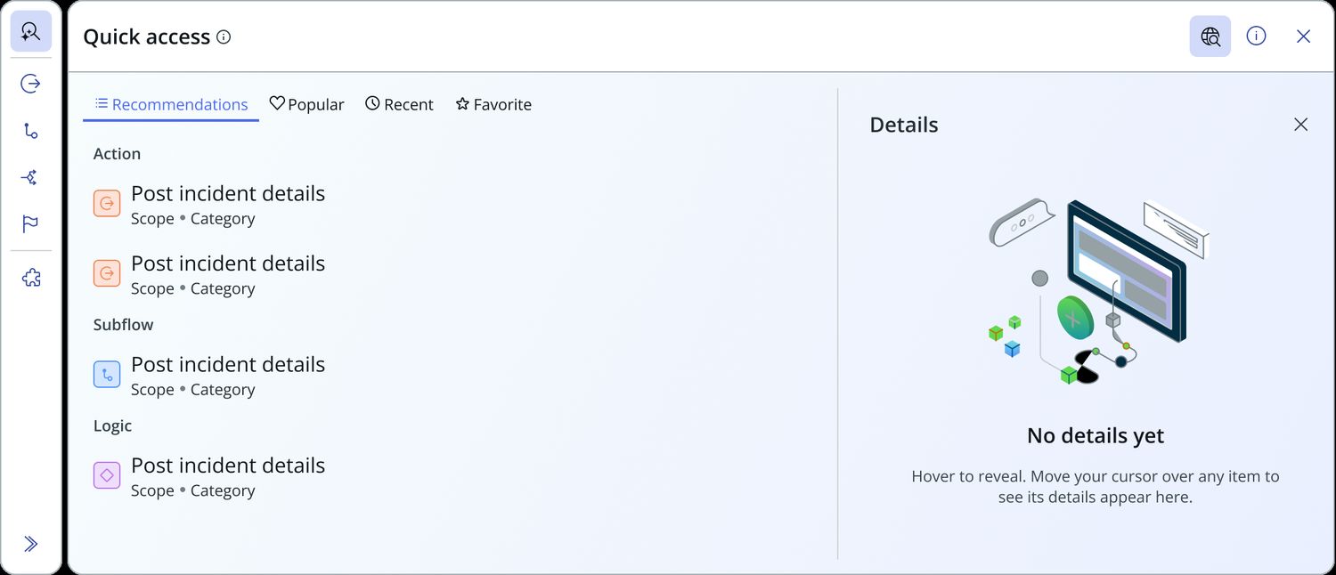
- The AI disagreement resolved by not forcing a single answer. The detail pane stays closed behind an “i” rather than being permanently open or permanently gone. Global search returns a flat, capped list with “View all” instead of an AI-only experience. AI is additive; it is never the only path to a result.
- Role-based AI rollout that invites rather than hides. Admins activate AI search; non-admins get an awareness modal prompting them to enable it. Nobody has AI forced on them, and nobody is left unaware the capability exists. That is a direct answer to the alienation concern.
- Two-pane per-artifact results with a manual refresh. Engineering validated it as feasible without a performance hit, and it answers the stale-results complaint directly.
- Sizing that hugs content with a max width, answering “the picker is not big enough” without letting it sprawl. Favourites and custom categories merged into one experience rather than separate tabs, per leadership review.
- A complete state permutation matrix, self-documented by filename. Six axes multiply out: type, AI search, sidebar mode, results layout, info panel and fixed summary. Every state in the prop spec exists as a rendered screen, not just a schema on paper.
- Shipped as a genuinely reusable component, not a screen: a full prop API
(
config,quickActionTabsContent,artifactToLabelMap,itemActions,searchResults,isSingleEntity,aisConfig), an event-dispatch contract, and two production instances:triggers-pickerfor single-entity andactions-pickerfor multi-entity.
The state permutation matrix
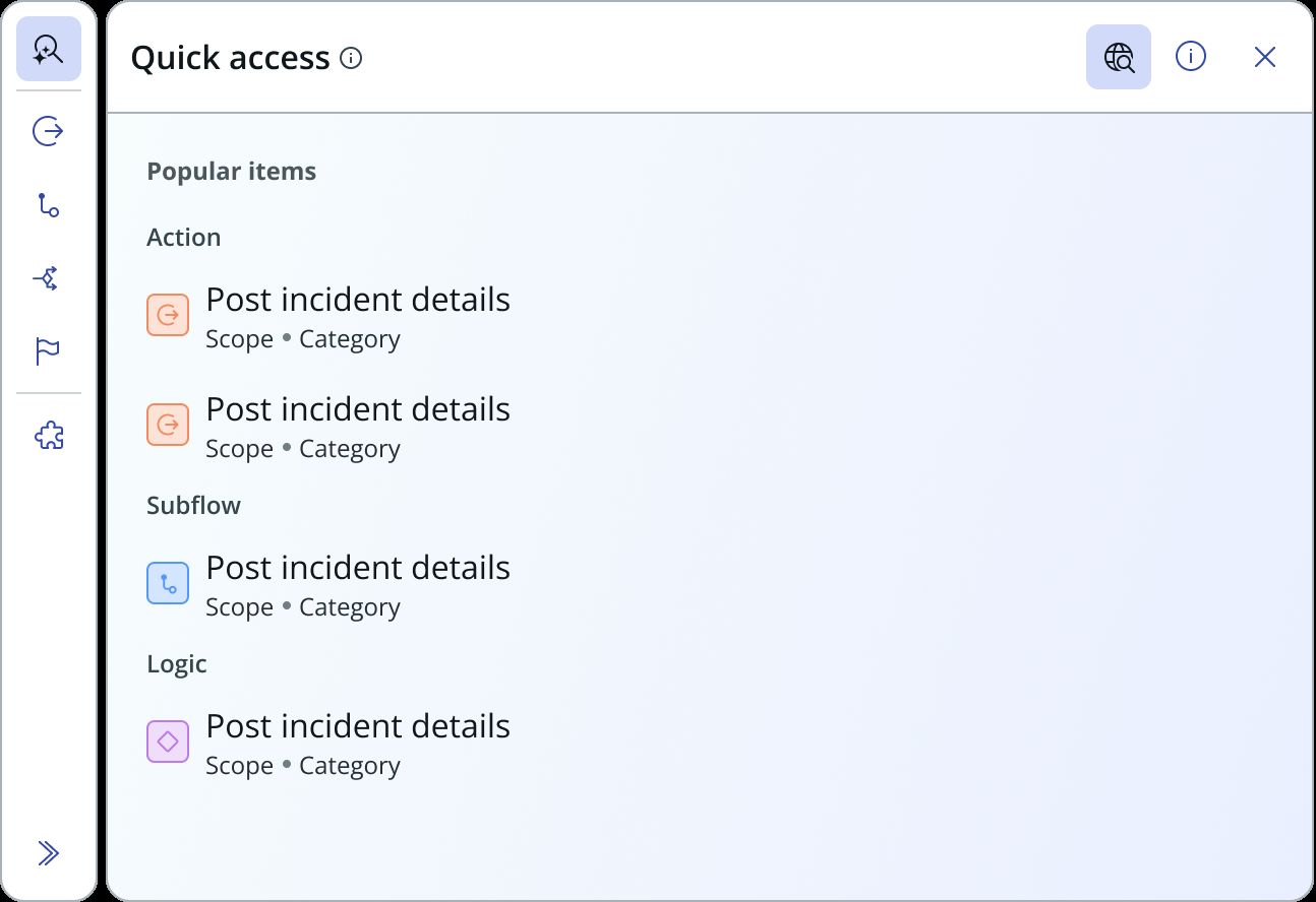
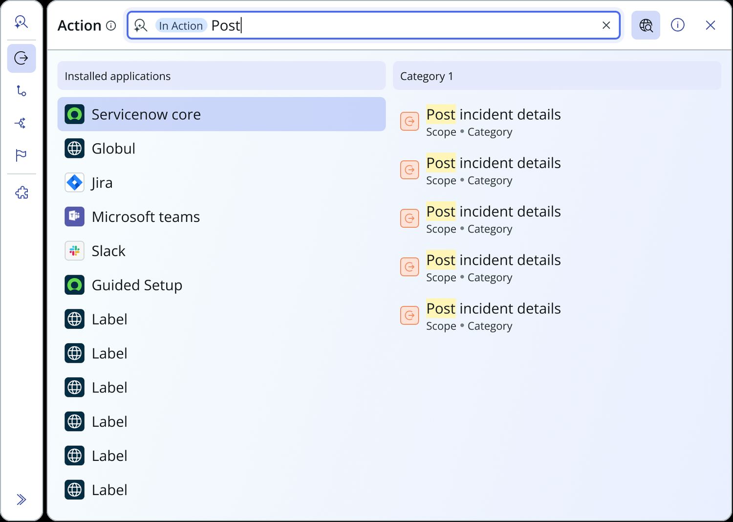
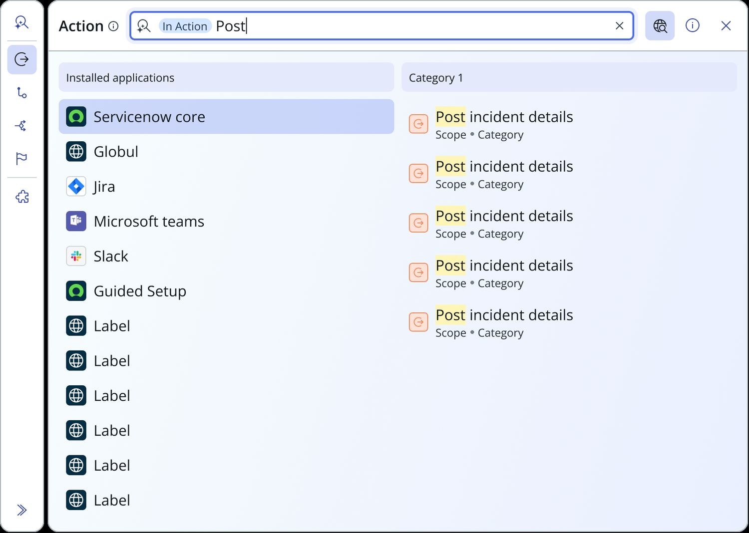
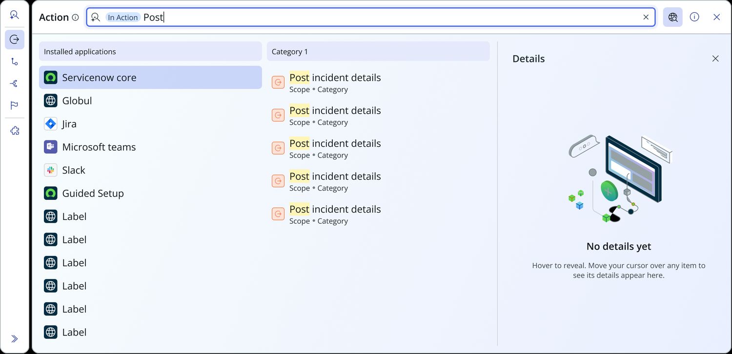
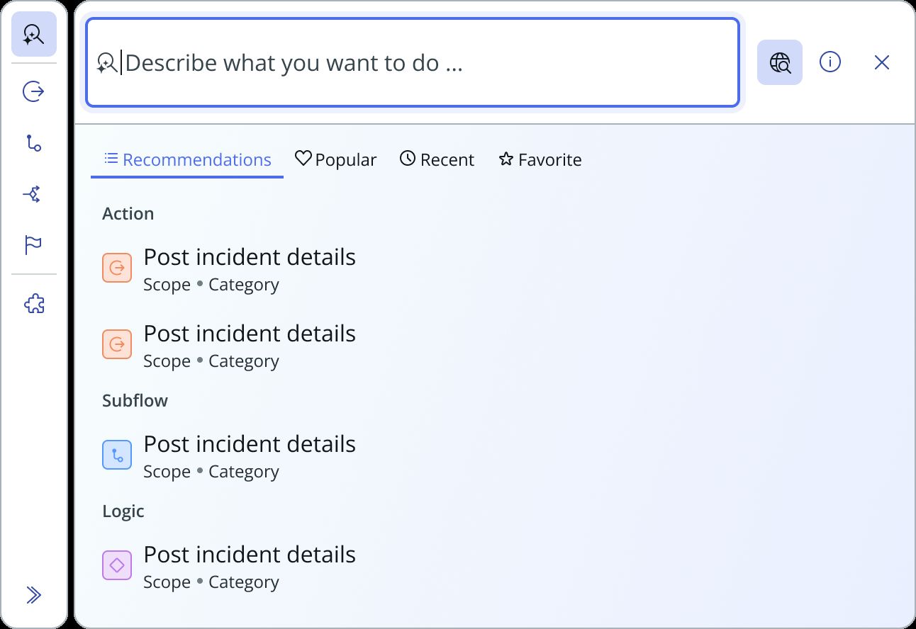
Forty-two rendered states, self-documented by filename: Type × AI search × sidebar mode × results layout × info panel × fixed summary. Eleven of them are below, ordered so that one variable changes at a time — which is what the matrix was for.
Every state named in the prop spec exists here as a rendered screen. That is what turned this from a set of mockups into a contract engineering could build against.
User flows
- Add a step
- Picker opens in Quick access
- Recommendations / Popular / Recent / Favourites
- Grouped by artefact type
- “i” for details
- Inserted on the canvas
- Describe what you want to do
- Results, single or double pane
- Scoped by spoke
- Expand details
- Insert
- Search a name
- No result
- Create action / Create subflow
- Action Designer
- Picker open on Activity
- Switch
- Subflow
- Same picker, new type
KPIs
inconsistent pickers consolidated into a single component
production instances wired up from one component: triggers and actions
post-migration parity checks passed outright
new regressions; all 3 flagged items were pre-existing functional gaps
This is the only project here with a genuine post-implementation verification step. The parity audit, by Yifan Deng, confirmed that add-step entry points, picker categories, browsing, search and canvas insertion all held up. Two things were flagged: a missing collapsed “uninstalled spokes” section, and missing Create Action and Create Subflow paths on an empty search. Both were absent in the legacy UI too, so the audit recommended escalating them to PM and engineering rather than treating them as design defects.
Still open
- Cross-product scoping. Raised by Brian Bimschleger, and not cosmetic. If a user creates a custom category in Flow Designer, does it appear in the Playbook picker? Is a custom category personal or shared? Are favourites per-builder or global? These are information architecture decisions about where personalisation lives.
- The flagged parity gaps. Whether PM and engineering picked them up.
- AI Prompt as a navigation item. Riya Kapoor explored making it top-level and pickable, on Jake Burman’s proposal. Outcome unknown.